Design Best Practice
Design Best Practice
When designing at Motocal we do our utmost to ensure that you do not need to know anything about design and print. We want to make sure designing your kit is as fun and easy as possible. We do everything we can to ensure your graphics look exactly as they are on screen.
Graphic Upload Specifications:
- PNG, JPEG and GIF graphics accepted
- The Minimium is 30KB file size
- Maximum file size is 500 KB with recommended 300 DPI. If you try to upload an image, and it fails then reason for failure will be listed.
Uploaded graphics are outside of our control
It is better to use our library if possible but if you do upload please follow these rules to ensure the best results and be aware the uploaded image might not look exactly as it does on screen when printed.
Please be aware of this.
Things to be careful of:
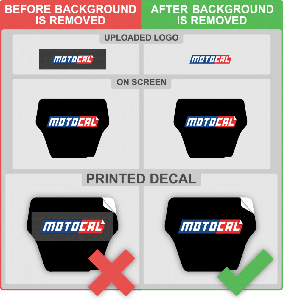
When uploading a graphic be careful of graphics with backgrounds. These are typically in black and white (but of course can be in any color). These colors will not match our printed colors even though on screen they look the same (Monitor limitations).
We suggest you:
- 1. Remove the background color. You can user our in-app editor that is right there when you upload your image. Couldn't be eaiser. Follow the onscreen instructions.
- 2. Use a different graphic with no background
- 3. Use a different decal color so the colors do not clash
- 4. Use our extensive library
Design Best Practice

Removing Uploaded Logo Backgrounds (E.g. Black)
For example if you have this uploaded graphic (below) with a square black background it will not match our rich printed black.

Images descriptions below
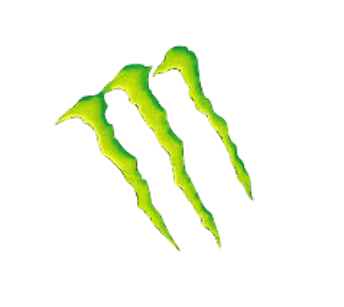
Image 1 – Monster logo with a black background
Image 2 – Monster logo image uploaded by user (It seems like the logo is an exact match and will print correctly – this is incorrect to assume)
Image 3 – After printing, most likely logo which has been uploaded will look like this. This is black, but it does not match the Motocal black. (Important to always remove background color)
Above illustrates the differences that can exist in different shades of blacks when printed. You will not be able to tell the difference on screen. However it can be solved by using our onscreen instruction when uploading an image.
To correct this:
Here is an example of an uploaded graphic with no background. Now when placed on a decal with a black background it will print exactly as it looks on screen.

Removing White Backgrounds

Images descriptions below
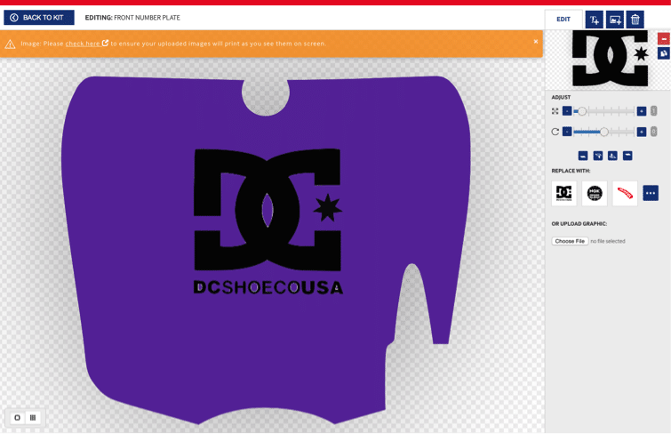
Image 1 – DC logo with white background
Image 2 – DC logo with white background uploaded and add to decal with purple background
Image 3 – We do not advise attempting to match the background of the logo, by adding a white background to the decal. It is always advisable to remove the background color.
Image 4 – When the background color is removed it will look like image 4 (below)

Don't Use Transparent Backgrounds
Please do not upload transparent graphics as you will not get the exact results as you see on screen as the transparent color will be effected by the background on the print. It will not look the same in print format as it does on screen.

Images descriptions below
Image 1 – User uploaded image with transparent stripes
Image 2 – Transparent Image added to the Motocal design editor
Image 3 – Printed version of transparent image. Motocal can not predict the results of the transparent decal against the background. As you can see in the 3rd image, the results are unpredictable
Remember - Don't Use Background Colors For Uploaded Images - Why?
By eliminating the background of a graphic, you are reducing the risk of colors crashing.
WRONG – Why? Background color is visible

CORRECT – Why? Background color has been removed.

ORDER NOW & SHIP FREE TODAY
Design your graphics online today and Motocal will ship them for free today to you.
